Let’s talk about you.
"*" indicates required fields
The OxyGeneo™ facial is the number one facial treatment in Canada, known to provide instant results with zero downtime using the power of oxygen. Tens of thousands of OxyGeneo™ facial treatments are performed every day, a testament to the strength of the OxyGeneo™ brand in the medi-aesthetic industry.
With the introduction of three new OxyGeneo™ facial treatments, our challenge was to retain the established brand recognition of the OxyGeneo 3-in-1 Super Facial™ while still paying respect to the manufacturer brand language.
Our approach for the OxyGeneo™ rebranding project was to make the brand mirror the characteristics of the new facial treatments while retaining key elements of the old brand. This approach ensured that the majority of the audience still recognized that it was the same brand with a new avatar.
Our approach mirrored the old saying, “If it’s not broken, don’t fix it. The “split face” model image had become an international icon and was a major identifier for the facial brand. We incorporated this image into the new branding to ensure it is easily recognizable.
We created a new modern logo highlighting OXY, the OxyGeneo™ brand’s differentiating component. We designed a new pattern that emulates bubbles to mimic the experience someone would feel when receiving the bubbly facial. We also highlighted vital product features like the use of all-natural ingredients to communicate product differentiation visually. Once we had completed the refresh of the brand logo, our team applied the new brand to all the marketing and branding collaterals.
LOGO
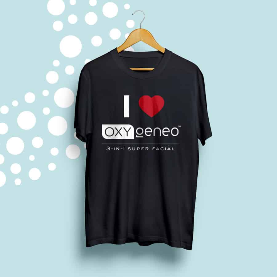
SWAG
The new brand imagery more clearly conveys the key benefits, making the facial an easier sell for aestheticians. The new colour palette provides a robust visual language to distinguish between product options and draw the user’s eyes to specific calls to action.
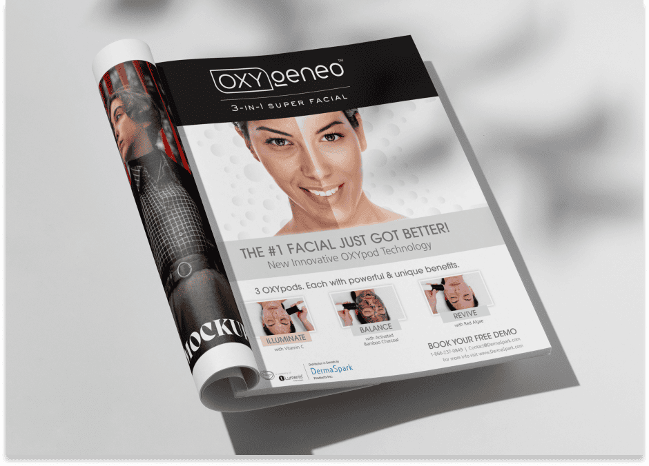
MAGAZINE AD
MEDIA WALL
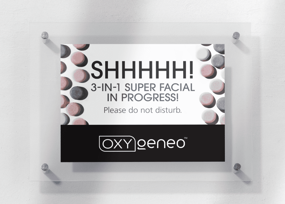
TREATMENT SIGN
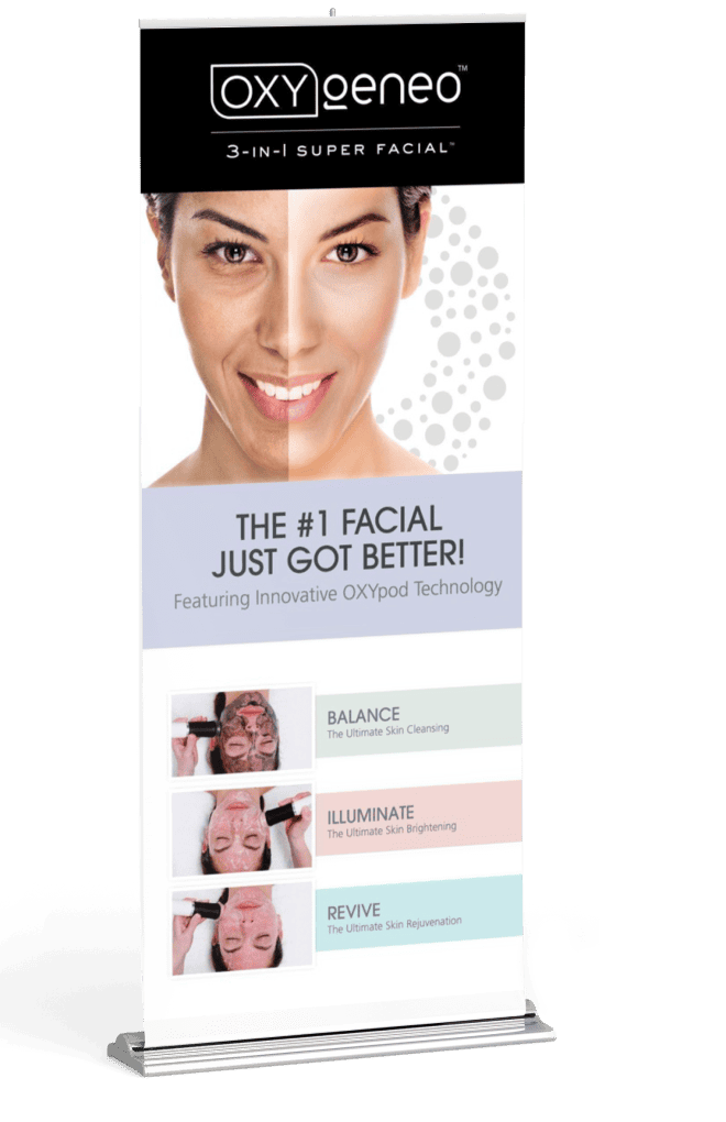
ROLL-UP BANNER
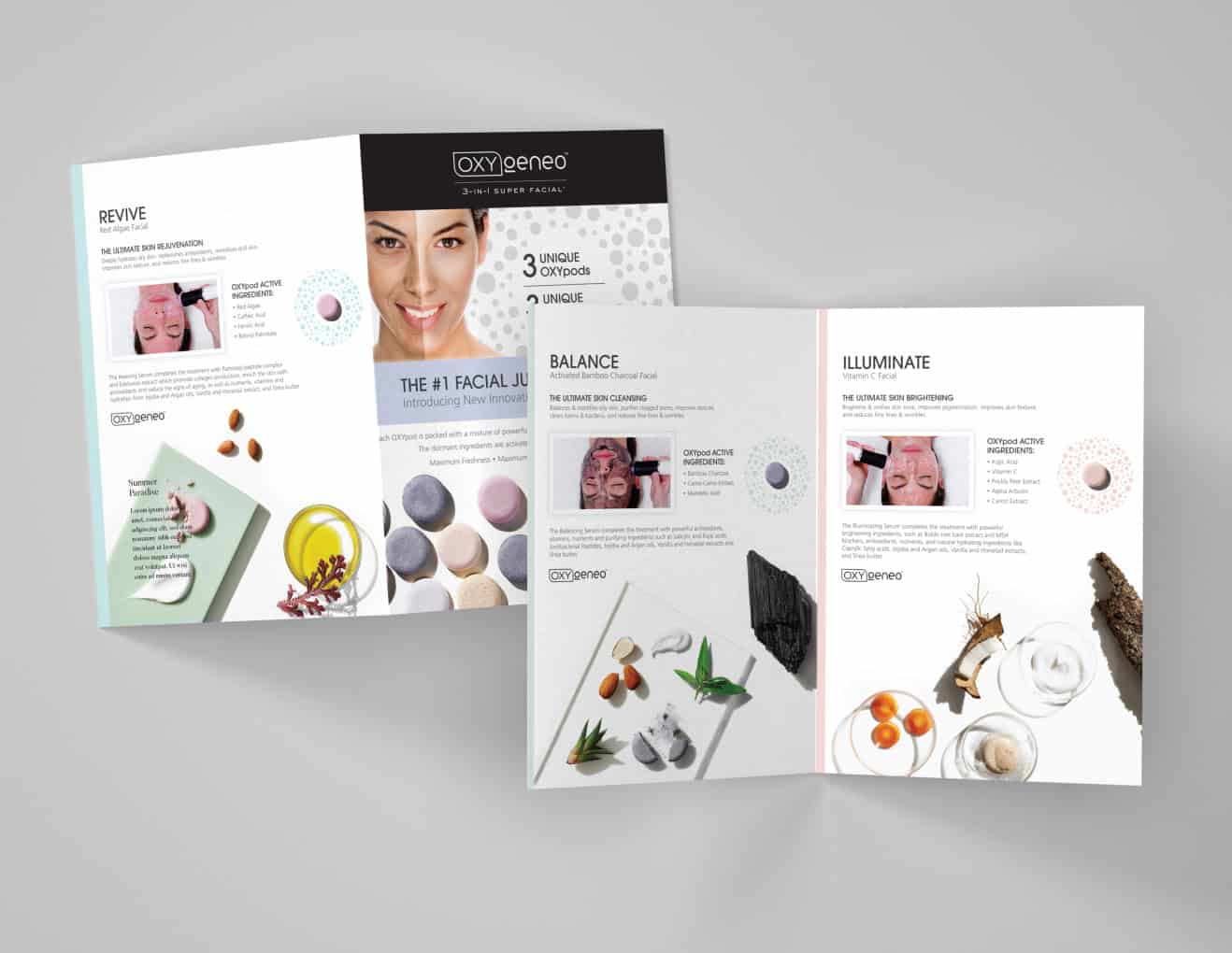
BI-FOLD BROCHURE