Let’s talk about you.
"*" indicates required fields
Their central principle is prioritizing expertise over expansion, a philosophy they believe can truly impact the industry.
We worked with the PLE team in 2018 and 2021, and we are big fans of their work, cheering them on to more success with each passing year. This case study is about the work we did in 2018 to develop their brand and create a solid brand foundation.
BRAND STRATEGY
BRAND FOUNDATION
The difference with PLE was that they had a vision of how to rise to the challenge and be an outlier in a fragmented and competitive market. They needed someone to help improve that vision and give it a visual and spoken language.
This is the time for curiosity, coffee and whiteboard sessions with the clients and our internal team to nail down the founder’s vision for their brand.
To create PLE’s visual identity, we developed a consistent, slick look that reflects precision, focus, attention to detail, and high standards. The goal of the brand identity was to position PLE as a market challenger that values mastery before massiveness.
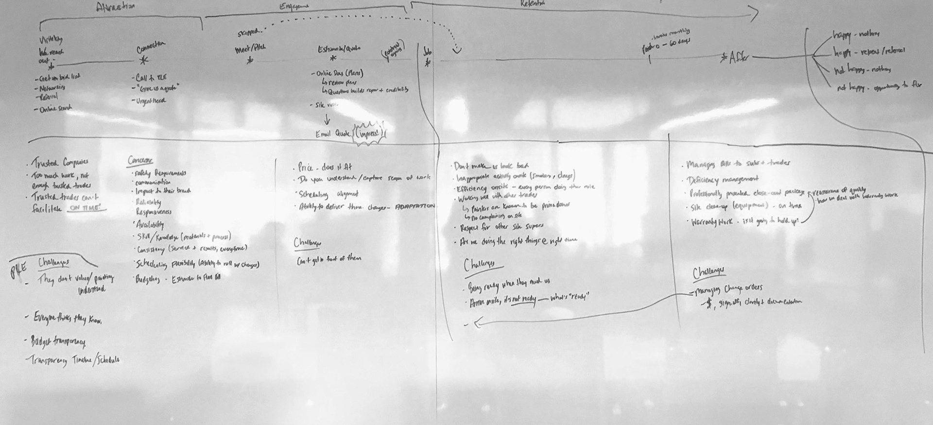
WHITEBOARD SESSIONS FOR PLE CIRCA 2018
We distilled the key descriptors of PLE: Striking | Bold | Precise
Those three words encompassed the PLE approach, which became the three Perfect Lines brand pattern. The lines not only aligned with the three core descriptors but also communicated multiple levels of the strategy, including their brand pillars:
The three striking lines through the logo represent the three core brand pillars. They also appear as painting tapes that painters use and add an additional layer to the visual language.
OLD LOGO
NEW LOGO
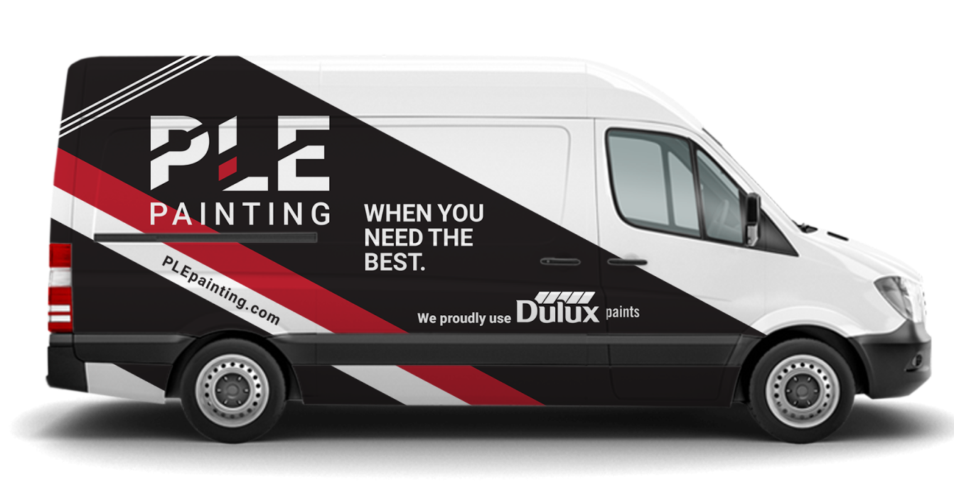
FLEET DESIGN
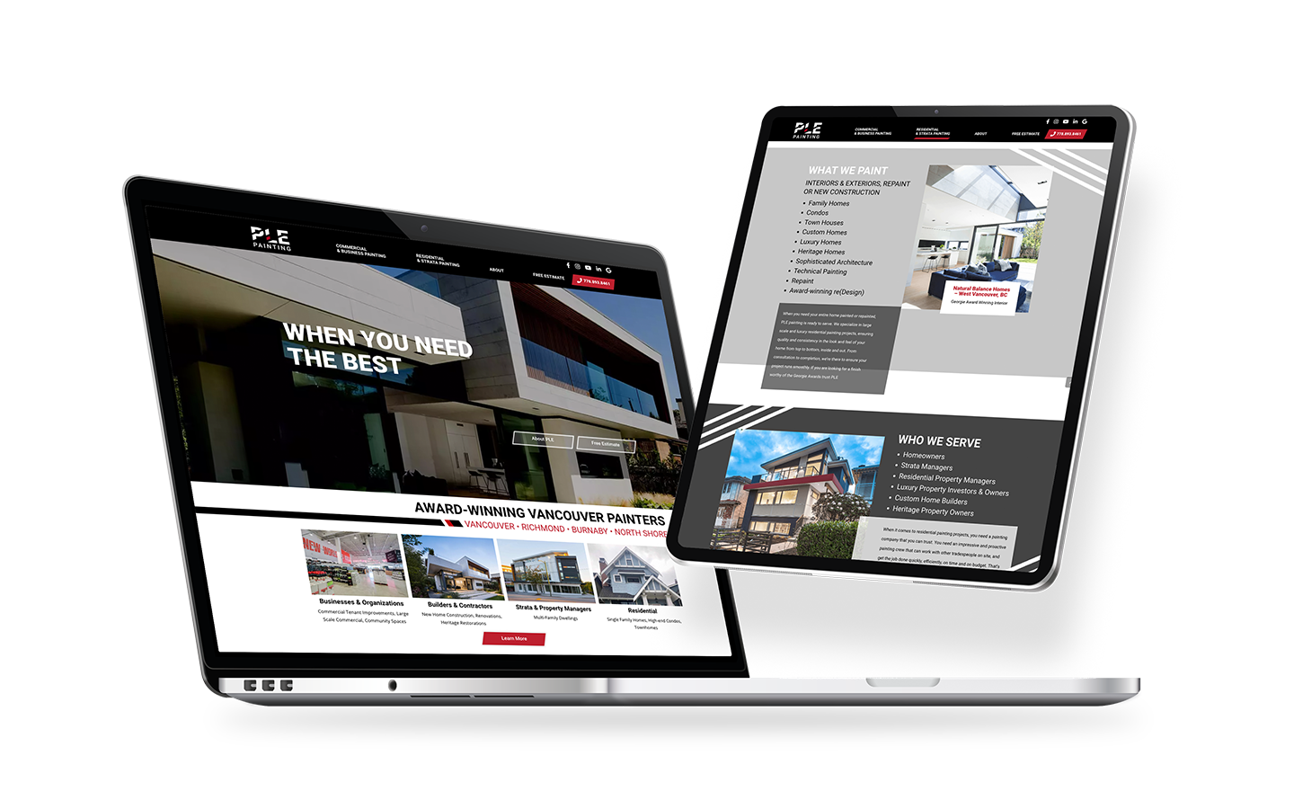
WEBSITE
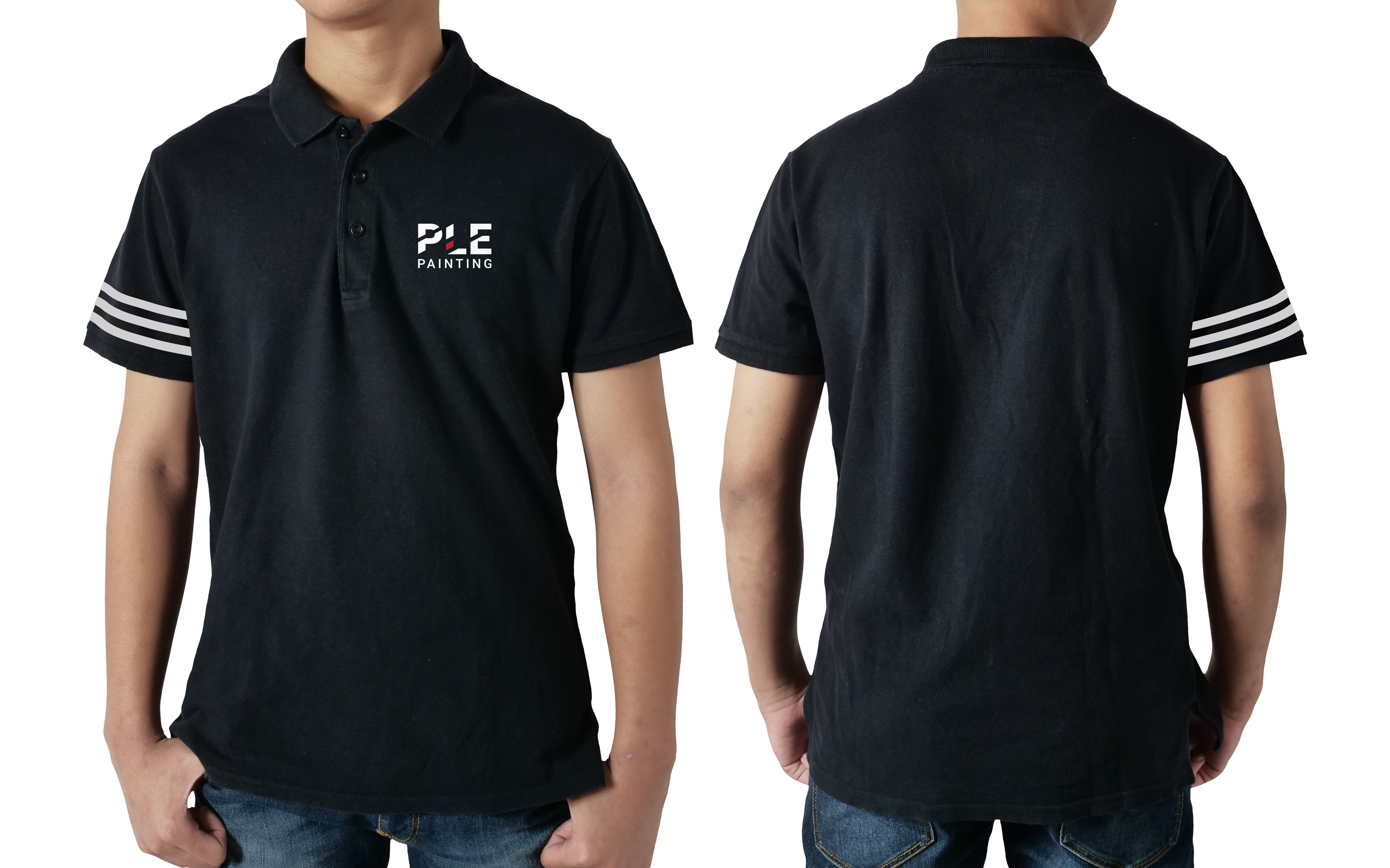
UNIFORMS
The PLE painting project culminated in the following:
Our work for PLE Painting won the 2018 Summit Marketing Effectiveness Platinum Award and the 2019 Ascent Winner- Global Trend Marketing Award.

AWARDS FOR PLE PAINTING