Let’s talk about you.
"*" indicates required fields



For over 50 years, Victory has been a trusted name in marine supplies, distributed through independent retailers across Canada. As the product line grew to more than 5,000 SKUs, packaging had evolved over time on a product-by-product basis, creating an opportunity to bring greater consistency and clarity to the brand.
Foundation
Alongside the visual identity work, we also explored Victory’s broader brand architecture to clarify the relationship between the product brand and the company behind its distribution.
From there, we developed the visual direction through moodboards and logo exploration before translating the new identity into a scalable packaging system.
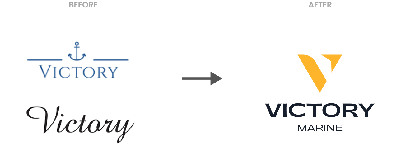
Bringing Victory’s heritage into a refreshed visual identity.
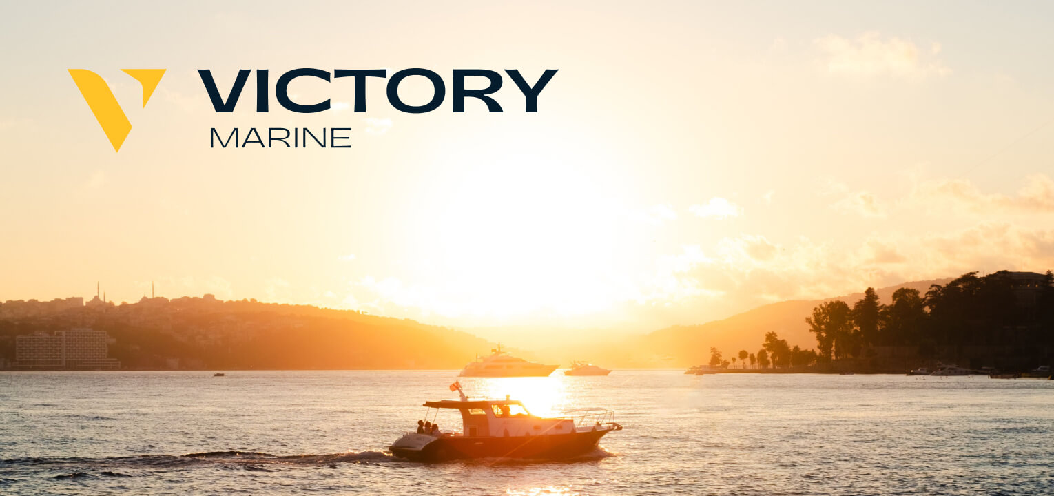
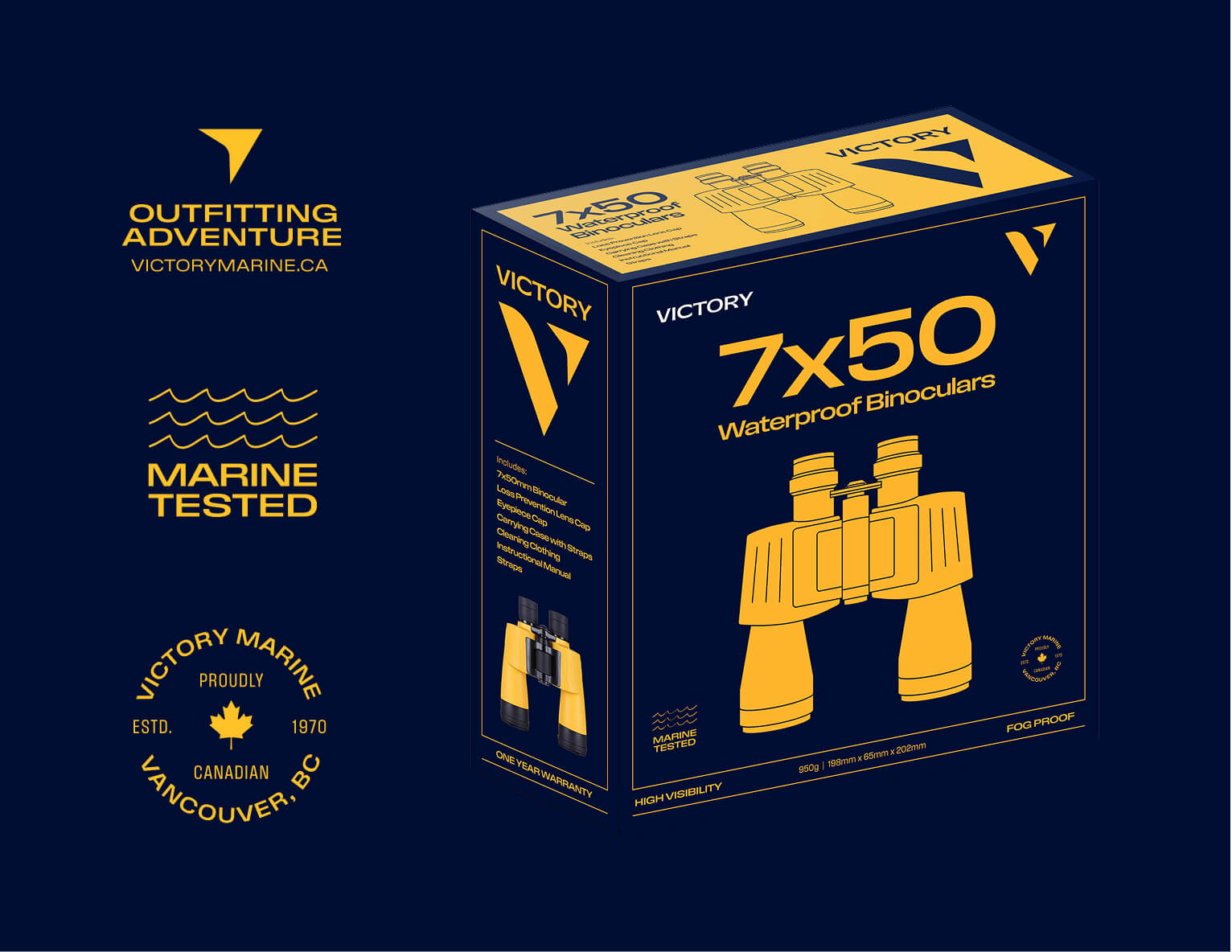
Inspired by golden hour on the water, the refreshed identity balances Victory’s established marine heritage with a more contemporary visual presence. The new logo captures a sense of direction and movement through a signature V-shaped mark, inspired by the path of a boat cutting across the water. Its forward-facing form gives the identity a feeling of momentum, while subtle nautical references connect it back to Victory’s roots.
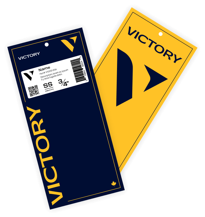
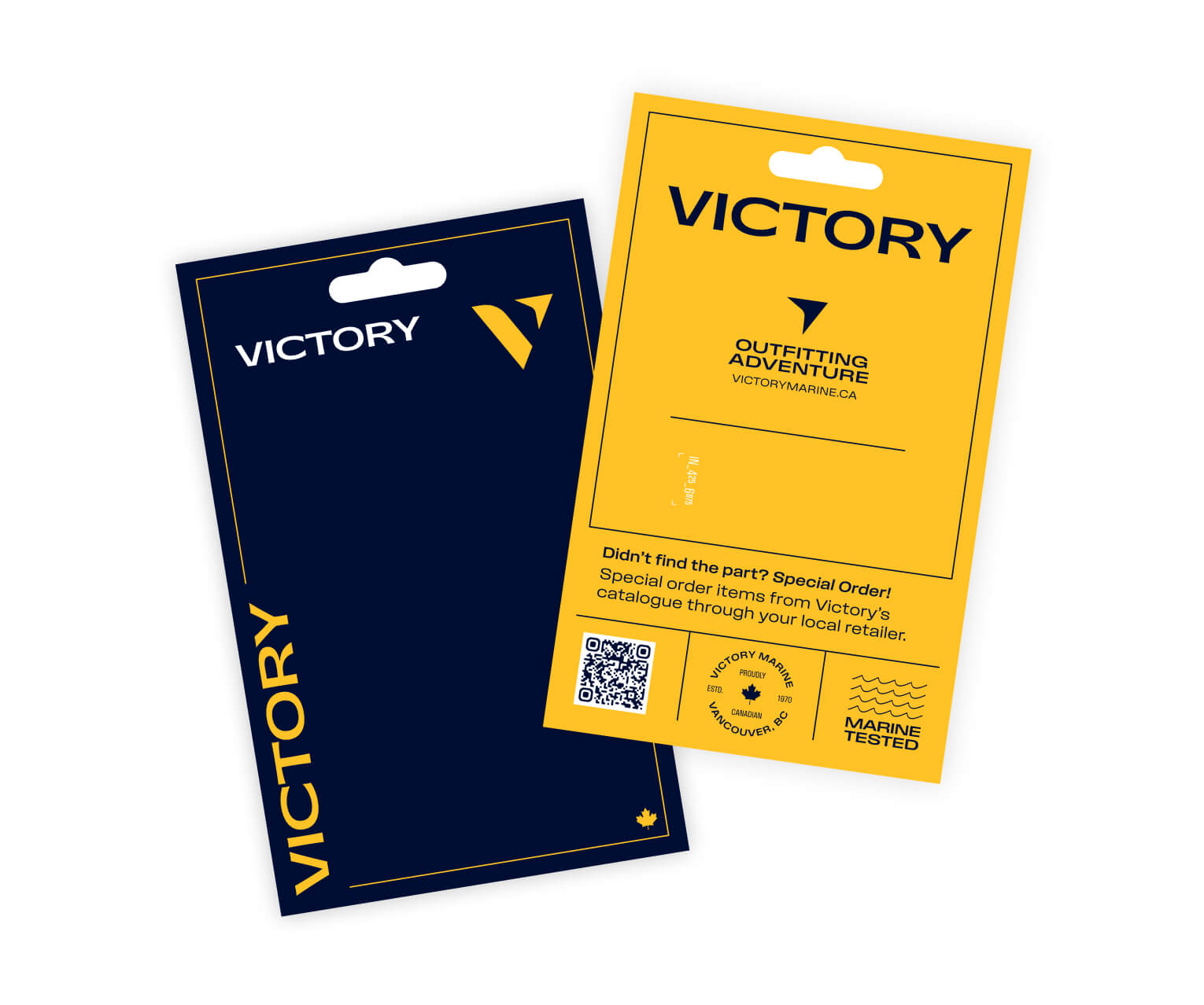
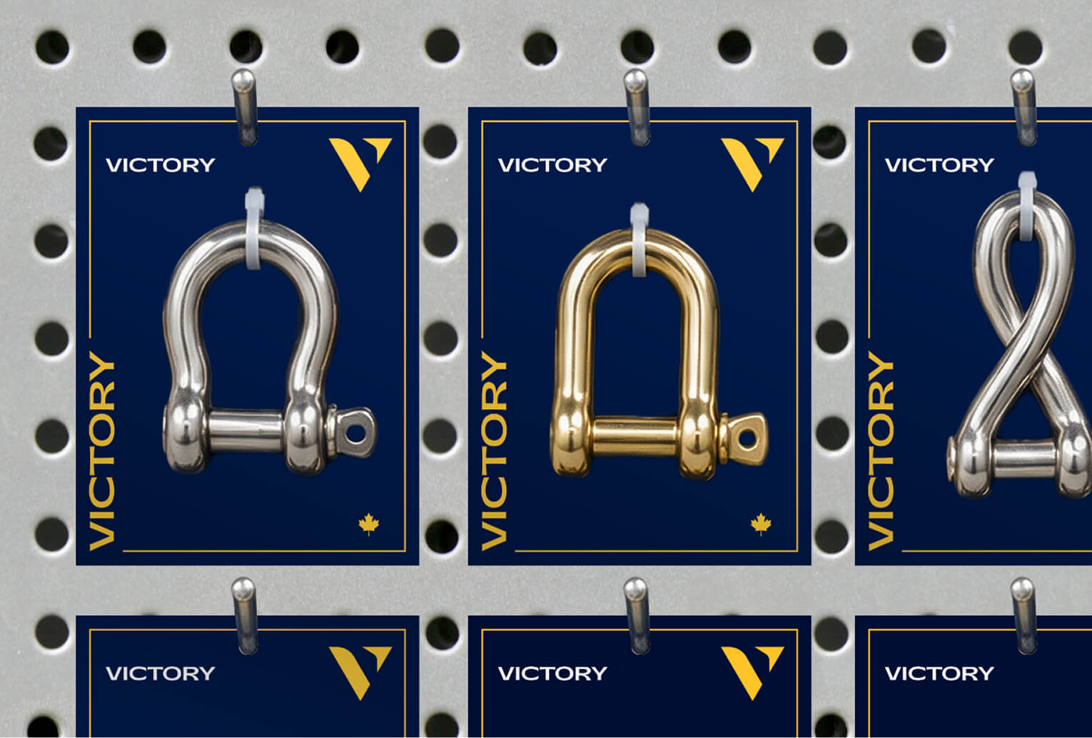
The new packaging system was designed to work across a large and varied product catalogue, creating a clear visual hierarchy that makes individual products easy to distinguish while maintaining a recognizable Victory presence across the shelf.
Rather than designing packaging as a series of one-off solutions, we established a flexible framework that the team can apply across future SKUs, making it easier to maintain consistency as the product line continues to grow.
The new foundation gives Victory room to grow without losing the recognition it has built over decades. With clearer structure behind the brand, future products can be developed more efficiently and consistently, while customers encounter a more recognizable Victory at every touchpoint.