Let's talk about you.
"*" indicates required fields

Drumroll, please!
We’re thrilled to announce that The REX Agency has been awarded five AVA Digital Awards in the areas of Brand and Category Strategy. The AVA Digital Awards is an international competition that celebrates excellence in digital communication, spanning various categories from web-based production to video and audio production. Administered and judged by the Association of Marketing and Communication Professionals (AMCP), winning an AVA Digital Award is a highly coveted achievement – and we’re proud to be recognized among the best in the industry.

Here are the five awards that The REX Agency won this year:
Award Type: 2023 Gold Winner
Client background:
CubicFarms System is a revolutionary ag-tech brand that is on a mission to save the world through its futuristic farming technology. They provide automated indoor growing technologies and services for sustainable produce, livestock feed, and plant propagation.
Their proprietary automated food and feed growing systems are designed to optimize productivity and minimize the impact of external factors such as weather, water usage, and land restrictions. By harnessing technology, CubicFarms is creating a sustainable and resilient future for the food and agriculture industry.
Challenges:
The biggest challenge for us with the vision video project was the short timeline for execution and delivery. To deliver the video on the dotted line, we put our project management hats on and created a work back schedule. We outlined the tasks, defined the dependencies, and assigned responsibilities and accountabilities for all stakeholders.
Another challenge was creating a vision video that would captivate an audience that ranged from 9-96 years old. For a technology brand like CubicFarms, structuring the complex messaging into a relatable story was daunting. To solve the messaging problem, our scriptwriters deliberately chose easy-to-understand stats and kept the language simple, minus the fluff.
Strategy and approach:
CubicFarms wanted a video that their employees would talk about at the bar and around the dinner table. To create a memorable video that would become a rallying cry for CubicFarms employees, we conducted audience research to understand the emotional state of our target audience.
Our research concluded that the majority of CubicFarms employees worked there because they cared about the planet and believed in technology to help move the needle. To engage this audience, we needed a script that was rooted in science and logic. Our writers used hard-hitting stats on food scarcity, food dependence, etc., to instigate curiosity and passion.
The script also touched upon the urgent need for creating food security and the need for a literal revolution in the agriculture sector. The closing argument of the video was how CubicFarm’s technology and its people could bring this revolution to the mainstream zeitgeist.
Implementation:
Even though the script was the hero, the visuals and audio were carefully selected to create the right effect. The idea was to let the message in the script create an impact and use audio/visuals to augment the process and help weave a narrative.
In order to make it work in the short timeline, we first locked the concept and script. To keep the timelines in our work back schedule sanctimonious, we sourced stock footage instead of shooting them from scratch. Since our video relied heavily on the messaging, we spent more time finding the right voice-over artist. Once the production was done, the video was released in an internal meeting at CubicFarms and uploaded to their Youtube channel after the private internal screening.
Analytics and evaluation:
The vision video received a standing ovation at the internal screening and garnered 4,000 views on Youtube. It was shared 350 times on social and internal channels.
Award Type: 2023 Platinum Winner
Client background:
Fitness Town is a leading fitness retailer brand, helping Vancouverites create personalized environments for fitness since 2006. They are a boutique Fitness Equipment Retailer that dominates Western Canada with seven stores and decades of everyday athletes and professional sports teams as clients.
The pandemic put the spotlight on online commerce and made business owners realize the importance of a solid E-commerce infrastructure. Fitness Town was right in the midst of the storm when the need for an improved Ecommerce platform became crystal clear. Their existing online store and infrastructure were dated and couldn’t handle the needs of the post-pandemic world. Even without the Pandemic, their online store in 2021 was in dire need of an upgrade.
Challenges:
To redesign an Ecommerce store for a brand like Fitness Town was a massive undertaking. They had thousands of products, and their existing online store was on a proprietary closed system with limited portability with other technologies. So we couldn’t rely on the existing system or dev team in the creation of the new store.
The biggest challenge was understanding the complex internal systems and processes at Fitness Town to develop an Ecommerce infrastructure that was seamless for the end-user and easy to use for the Fitness Town team. From researching the technology stack to negotiating better deals from vendors like HubSpot/Shopify, we left no stone unturned to ensure that the Fitness Town team got the best solution to set them apart from the competition and set them up for long-term success. The biggest advantage for us in this process was the support of the Fitness Town management team.
Strategy and approach:
From the get-go, we wanted to ensure that the new online store was state-of-the-art and resonated with their target market. We delved deep to figure out:
Implementation:
It took us a few months to find a development partner and create the initial requirements for the project. We finalized a headless Ecommerce store made on Shopify, WordPress, Gatsby frontend, and Jambstack framework for Fitness Town.
Once we had partnered with Jambaree, it was time to turn the requirements from the proposal into actual requirements for a scope of work. We did a lot of planning to come up with a cadence for internal meetings, meetings with partners, and meetings with stakeholders at Fitness Town to keep the project rolling.
Wireframing, UX Research, Designing, Requirement Documentation, Copywriting, Project Management, etc., were all executed in parallel. After the initial requirement and proposal phase, it took us ten months to take the project live. It was a year-long marathon to the finish line.
Analytics and evaluation:
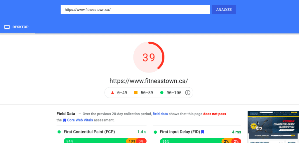
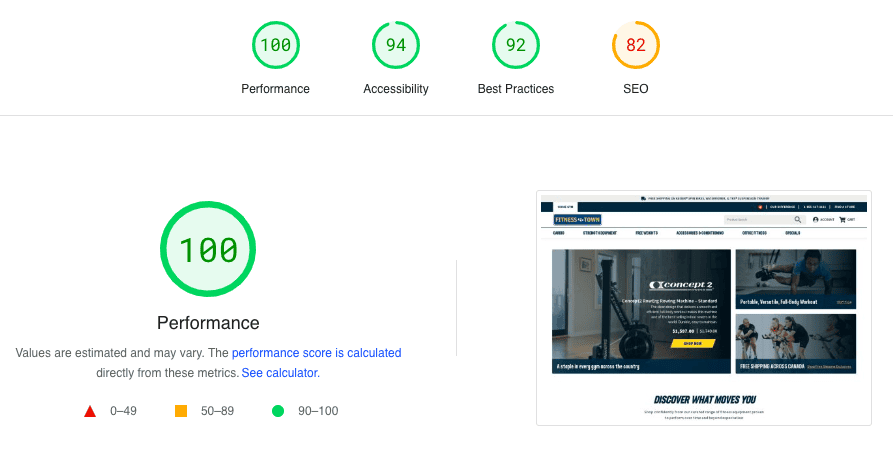
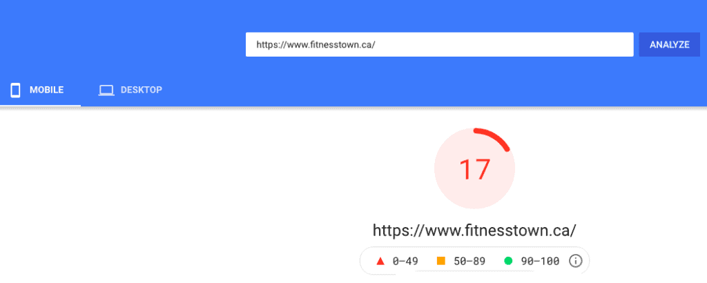
The new Fitness Town E-commerce store is blazing fast. Comparing the site performance to the old website, the new store felt like a Ferrari juxtaposed with an old station wagon. Don’t believe us and see for yourself.
Old Fitness Town Website Desktop Performance
New Fitness Town Website Desktop Performance
Old Fitness Town Website Mobile Performance
New Fitness Town Website Mobile Performance
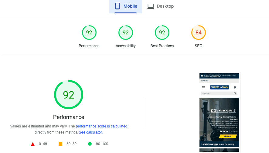
Performance is only one metric where the new website outperformed the old one. There are tons of improvements on all fronts that are captured in a fascinating case study that is in the works as we write this.
Award Type: 2023 Platinum Winner
Client background:
CubicFarms System is a revolutionary ag-tech brand that is on a mission to save the world through its futuristic farming technology. They provide automated indoor growing technologies and services for sustainable produce, livestock feed, and plant propagation.
ALLWays Local is a produce brand launched by CubicFarms to help their farmer partners reach a larger and mainstream market. ALLWays Local is sustainably grown produce indoors by CubicFarm’s Farmer Partners using a CubicFarm System. With their automated indoor modular agriculture technologies, CubicFarms is empowering farmers to localize food production at a commercial scale.
Challenges:
The challenge with launching a brand like AllWays Local was figuring out where to start. There was literally no baseline, no reference point for launching a produce brand that was grown inside a metal container with conveyor belts and automated sprinklers.
Strategy and approach:
Having had no baseline, we had a lot of room to experiment and launch the brand in a way that vibed with the target audience. Since the target audience was pro-environment and mostly well-read, our script relied heavily on highlighting benefits and stats that would land with an evolved audience.
Even though the problem that ALLWays Local was trying to solve was a serious one, our approach for the messaging was to make it light-hearted so that the message made a positive and lasting impact on the audience.hing a brand like AllWays Local was figuring out where to start. There was literally no baseline, no reference point for launching a produce brand that was grown inside a metal container with conveyor belts and automated sprinklers.
Implementation:
The entire REX team came together for this project, and each volunteered to become extras on the video shoot. It was a rare and unplanned bonding moment for everyone on the team. Shot at Stong’s Market North Vancouver in one night and brilliantly planned production by the Noravera team, the ALLWays Local launch promo video was one of our proudest moments. So much effort was put into the shoot, and everyone chipped in.
Award Type: 2023 Platinum Winner
Client background:
CubicFarms System is a revolutionary ag-tech brand that is on a mission to save the world through its futuristic farming technology. They provide automated indoor growing technologies and services for sustainable produce, livestock feed, and plant propagation.
Challenges:
Creating a website for a publicly traded company like CubicFarms is always challenging. There are so many additional boxes that need to be checked for a public company website. CubicFarm’s technology is quite sophisticated, and translating it on the website in a way that appeals to farmers, investors, and partners required extensive design cycles.
Strategy and approach:
The brief for the CubicFarms website design required us to use videos across the website to showcase the tech. The brief also stated to utilize the brand icon ‘X” in the design and create a brand texture/pattern standard. We also incorporated the ALLWays Local packaging into the website design. We had very specific naming standards for CubicFarms Systems Corp., CubicFarm System, and HydroGreen System.
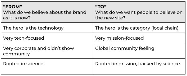
Our creative strategy for the website design was to use a “FROM” to “TO” framework. A snapshot of that framework:
Implementation:
We chose WordPress as the CMS for the CubicFarms website. The reason we chose WordPress was because of the various integrations we needed to implement. From NetSuite API to accessibility plugins, many technical requirements made WordPress the ideal choice. Our development team implemented custom code and did rigorous testing to ensure that the website design looks consistent on mobile as well as on a projector screen.
Analytics and evaluation:
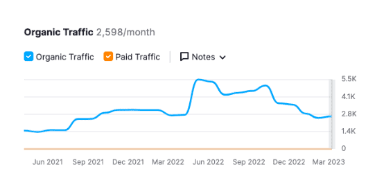
The CubicFarms website went live in Sep 2021 and saw a 200% increase in traffic within a year of launch.
Award Type: 2023 Gold Winner
Client background:
McAllister Industries is a 100-year-old industrial steel springs category leader. McAllister Spring, as it was called then, was founded in 1915 as one of Canada’s original manufacturers of automotive leaf springs, thriving on servicing the local logging industry. Now they are a time-tested and reliable supplier of custom, high-quality North American steel products.
Challenges:
Working with an industrial manufacturer like McAllister posed a significant challenge due to their traditional and old-fashioned approach towards their business. Although this approach was suitable for their factories, it hindered the creation of futuristic systems and processes. We had to navigate through a plethora of technical jargon to simplify the brand essence without compromising the unique quality that distinguishes MacAllister from the rest.
Revamping the outdated visual identity of the MacSpring brand posed another hurdle as we were constrained by time and unable to undertake a comprehensive visual identity creation process. We had to think quickly and strategically on our feet and focused on revitalizing the existing branding to ensure its usability on the website.
Strategy and approach:
We were tasked to develop a bold new brand personality and digital presence that would facilitate business development and the acquisition of top talent from the next generation.
To create a memorable user experience and achieve all business objectives, our design and copy on the website were developed based on the following requirements:
Our big-picture strategy was from OLD to BOLD. All the messaging and aesthetics on the website drew heavily from our OLD to BOLD strategy.
Implementation:
Our approach for the MacSpring website was to leverage the allure of old-school charm by infusing it with a modern twist. By utilizing the rich history and legacy of the MacAllister brand as a competitive edge, we curated an immersive website experience that seamlessly blended the traditional with the contemporary, thereby bringing it up to par with the demands of the 21st century.
Analytics and evaluation:
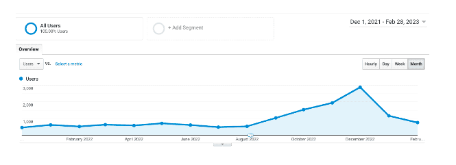
Since its launch in Dec 2021, the MacSpring website has received consistent traffic every month. After six months of launch, the website traffic increased month on month to reach new highs in Dec 2022.
We’re proud of our work, but we know that awards are just the cherry on top. The real heart of our approach is our proven process of strategic brand positioning and audience understanding to create a brand strategy that transforms culture, sales, and marketing. Our ability to create a brand strategy that leaves a lasting impact is what sets us apart.
Are you struggling to make a mark in the crowded marketplace? Are you unclear if your marketing tactics are working or contributing to your business goal? Do you have a gut feeling something just isn’t working? We got you. Contact us today.