Let's talk about you.
"*" indicates required fields

Reading is one of the most fundamental ways we acquire information, gain understanding, and engage with external ideas. Since the early 2000s, our reading habits have increasingly shifted from traditional media like books and newspapers to digital formats like ebooks, websites and mobile apps. On top of that, we are increasingly spending more time on digital devices and networks.
The stats speak for themselves:
We spend a staggering 6.5 hrs online every day.” Forbes.
A typical adult is likely to spend 17 years of their lives online.” Fortune.
These numbers are a clear indication of where the wind is blowing. Regardless of the risk of our increasing reliance on digital media, it is clear that we are spending a considerable amount of our time consuming content on the internet. And reading online is a big part of that journey. But how exactly do people read online?
The general consensus in 2025 is that online users don’t read in a linear progression. These users are prone to scanning a webpage instead of progressing line by line and reading every word. To add to that, users on an average don’t spend more than 15 seconds on a webpage. Our attention spans are getting smaller and smaller and it is becoming increasingly difficult for marketers to create stickiness with their written content.
From a branding and marketing perspective, how people process text content on a webpage has become increasingly critical.
Earlier studies, including a well-known one from 1997, found that people read 25% slower on screens compared to print. But with modern display tech and refined interface design, newer research has found little to no difference in reading speed between digital and print for most readers today.
The OG usability and ux research organization, the Nielsen Norman group has been conducting eye tracking studies for the past 15 years to decipher our online reading habits. Here is the sauce from their studies:
Internet users don’t read word for word and instead prefer to scan a webpage. Standout elements like headings, tables, images and keywords catch their attention as they locate the relevant information.
All my peers who are painstakingly researching and writing each and every word for their web content, the writing is on the wall: Instead of big blobs of texts, use more creative ways to package the content that makes it easier for the reader to consume.
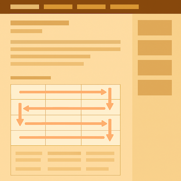
Research from Nielsen Norman group found out that when users are presented with content in distinct blocks, users tend to process content in a pattern that resembles a lawnmower progression.

Users start processing content from the top left corner until they reach the end of the row, after which they go to the row below and move towards the left until they reach the end of the row and the cycle repeats.
Digital users read a webpage in an F-shaped pattern, where users read horizontally across the top of the page, then move down slightly and read across again, followed by a vertical scan down the left side. This finding was first documented in 2006 by the NN group and re-confirmed by other independent studies.
It is critical to note that the F-pattern is observed on a webpage with text content and is not replicable on image heavy webpages. Another critical observation from the Wichita State University study, is that the F-shaped pattern scanning is more observable when users are searching for information vs just browsing the page. NN Group also clarified in a blog post that the F-Shaped pattern is applicable for the content area of the webpage. They also observed similar behavior when reading text content on a mobile device.
Elements like headings, bullet points, and highlighted keywords help guide users’ eyes and improve content discoverability. This is not a surprising insight but many webpages do end up looking like a wall of text. This finding reinforces a hack SEO’s have been using forever, stuffing keywords into H1 and H2 tags because Google crawlers and users both like to find critical info in the headlines.
Researchers recommend placing information up front so that it is easier to scan. They call it front-loading the critical information and is a technique used by teachers as well as leadership coaches to help their students focus on the task at hand. They also recommend keeping the language simple, clear and concise.
Here are some actionable guidelines for writing and designing web content:
There are tons of other recommendations that are useful for folks who are developing content and designing interfaces for websites. Buy the full report here.
There are few important contextual considerations that content developers should keep in mind. Generally speaking, most people scan content instead of reading it and the amount of time they are willing to spend is dependent on the following factors:
Wikipedia is one of the biggest websites in the world and is mostly text content. They recently did a major readability upgrade and made changes to its website properties to improve the reading experience across different types of users and devices. It’s a solid, real-world example of a high-traffic content platform aligning itself with how people actually read online: scanning, skimming, and navigating in non-linear ways.
If you’re building a brand, growing a business, or leading any kind of digital presence, understanding how people read online isn’t just helpful, it’s essential. Experts across UX, content, and branding agree that readability is not just about how things look. It directly impacts how content performs.
Clear, well-structured content helps users find what they need faster, builds trust, and increases the chances they’ll take action, whether that’s signing up, making a purchase, or simply remembering your brand.
If you’d like to learn how you can create content that works with the way people actually read online, get in touch. We’d love to help you build content that connects, converts, and leaves a lasting impression.