Let’s talk about you.
"*" indicates required fields



The founders had a clear vision for the space and product, but needed to define the brand, audience, and experience that would bring it all together. We partnered with the team to develop the strategic foundation for the concept, from understanding the customer and defining the brand idea to naming, messaging, visual identity, and the digital and physical experiences that would bring it to life.
Through discovery and audience research, we explored not only who Merōs was for, but the role it could play within a customer’s day.
The opportunity was bigger than creating another place to grab yogurt. Merōs could turn the small gaps between everything else happening in a busy day into moments worth looking forward to — bringing together nourishment, enjoyment, and a sense of personal ritual.
Rather than positioning yogurt as simply a meal, snack, or indulgence, Merōs could occupy the space between them — an adaptable form of nourishment that fits naturally into different routines and occasions.
Finding a name that could hold the idea.
The naming strategy looked for something distinctive and ownable that could connect back to the brand’s central idea without being overly literal.
We established a set of criteria to guide our exploration: Descriptive & Distinct, Scalable & Enduring, Culturally Sticky, Elevated.
Merōs was selected due to its strong conceptual fit and aspirational tone. Merōs is an architectural term for the raised space or segment found between the channels within a single element of a Doric frieze (above a greek column). Literally the space in between. It also creates a subtle nod to Greek heritage as a beautiful through-line for the product itself without being overtly literal. The story is there for the telling!
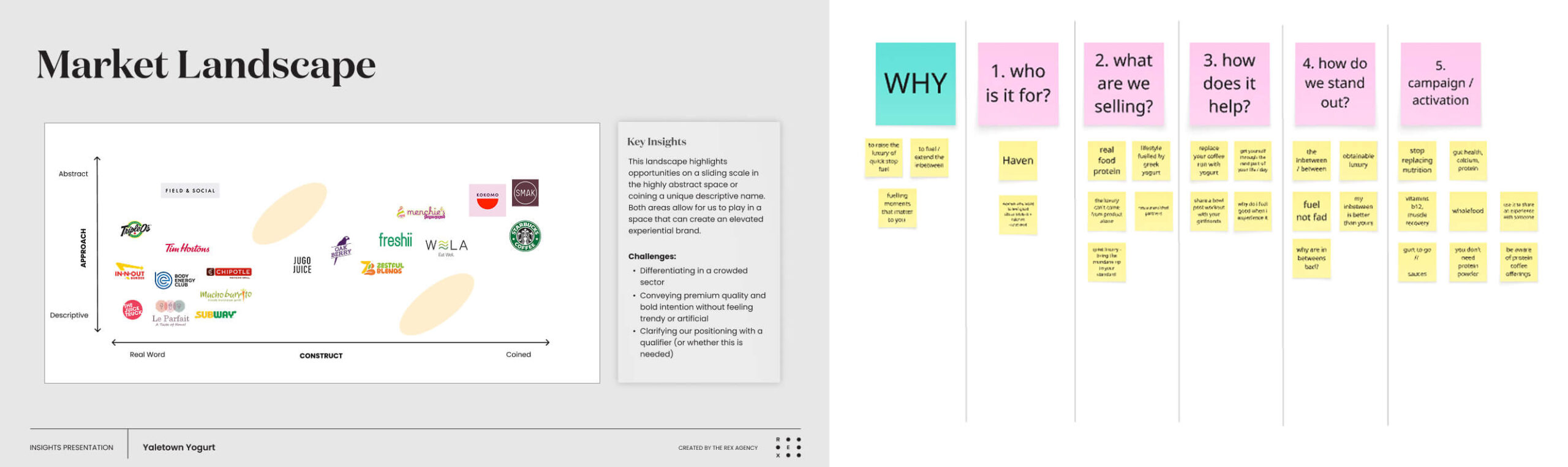
NAMING EXERCISE
Merōs exists to bring nutritionally smart, emotionally satisfying nourishment to life’s in-between moments.
The brand strategy positioned the experience around three complementary ideas:
NOURISHMENT
Thoughtful ingredients and satisfying nutrition designed to support how people actually live.
RITUAL
Small moments of intention that can become a meaningful part of an everyday routine.
DISCOVERY
A curated approach to flavours, toppings, and customization that gives customers something new to explore.
Together, these pillars created a flexible foundation for everything from the menu and customer experience to future campaigns and communications.
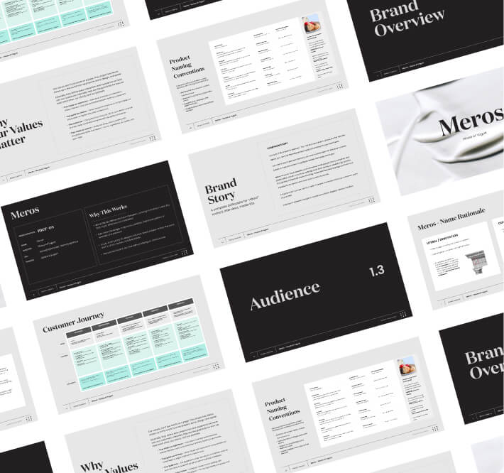
CREATING A VISUAL LANGUAGE FOR EVERYDAY MOMENTS WORTH ELEVATING
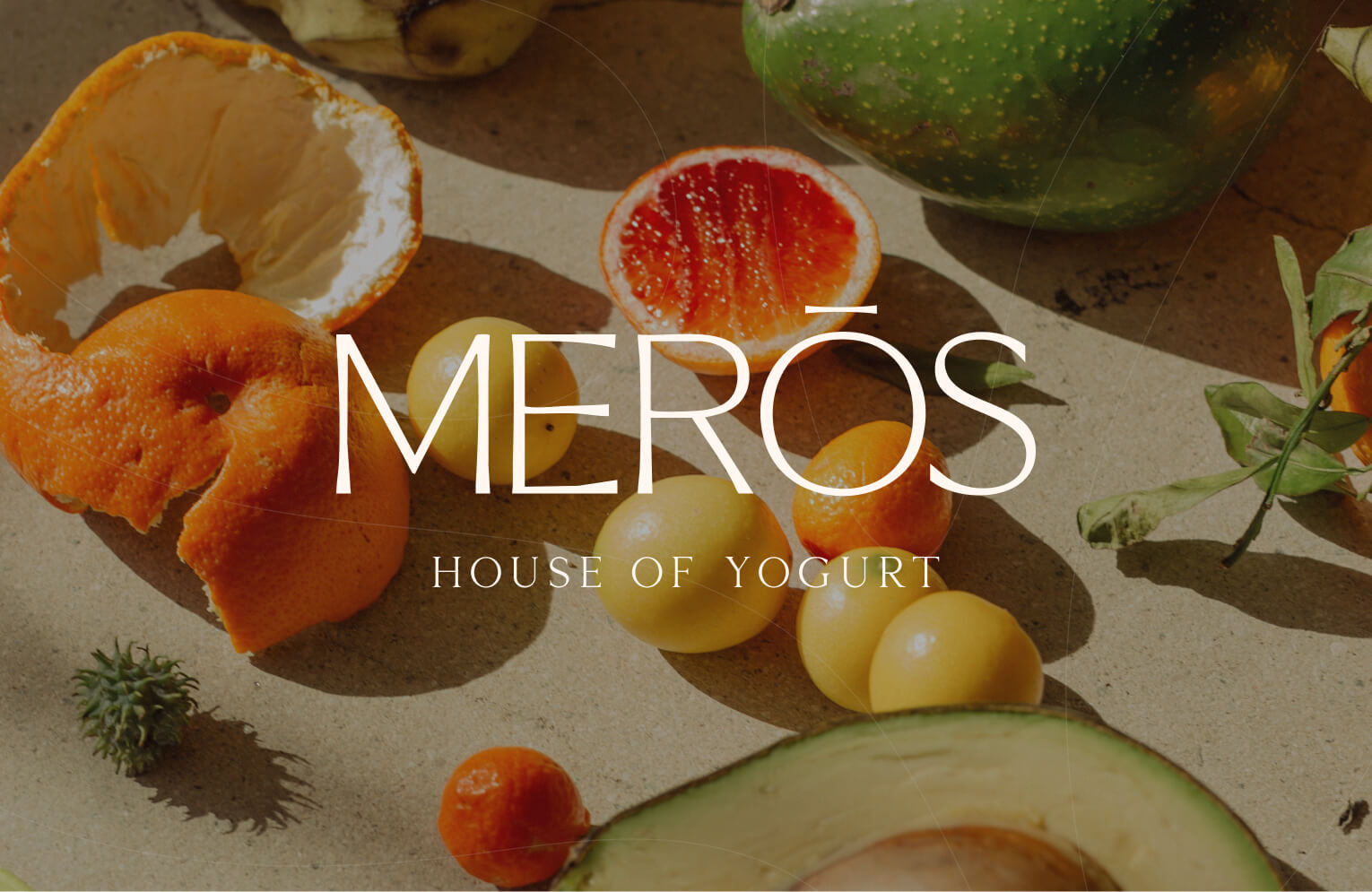
The visual identity brings the Merōs experience to life through a balance of organic form, clean lines, and considered simplicity. The icon sits at the heart of the system – a contained, organic form inspired by the natural curves of yogurt, the centre of a piece of fruit, and the view of a yogurt bowl layered with toppings. Its simplicity gives the brand a distinctive visual cue that can stand on its own or be used as a texture over photography.
The typography builds on this sense of clarity, using clean, contemporary forms with subtle character and refinement. A soft, natural colour palette adds warmth and reinforces the fresh, approachable character of the brand, while elevated photography captures the delicacy and beauty of the ingredients. Fruits, textures, and toppings are given room to shine, creating imagery that feels refined, tactile, and inviting. Together, these elements create a cohesive identity that feels thoughtfully crafted across the brand’s physical and digital touchpoints.
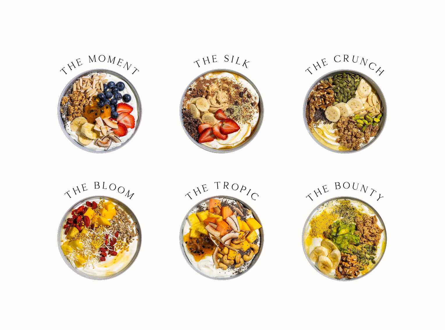
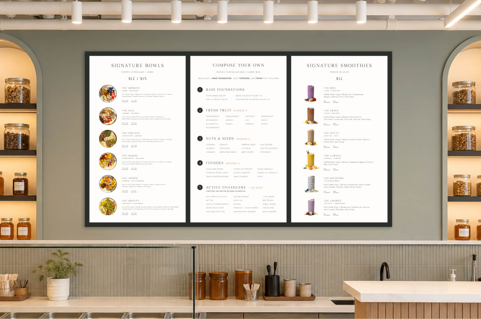
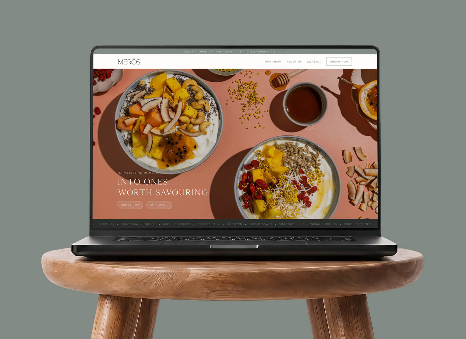
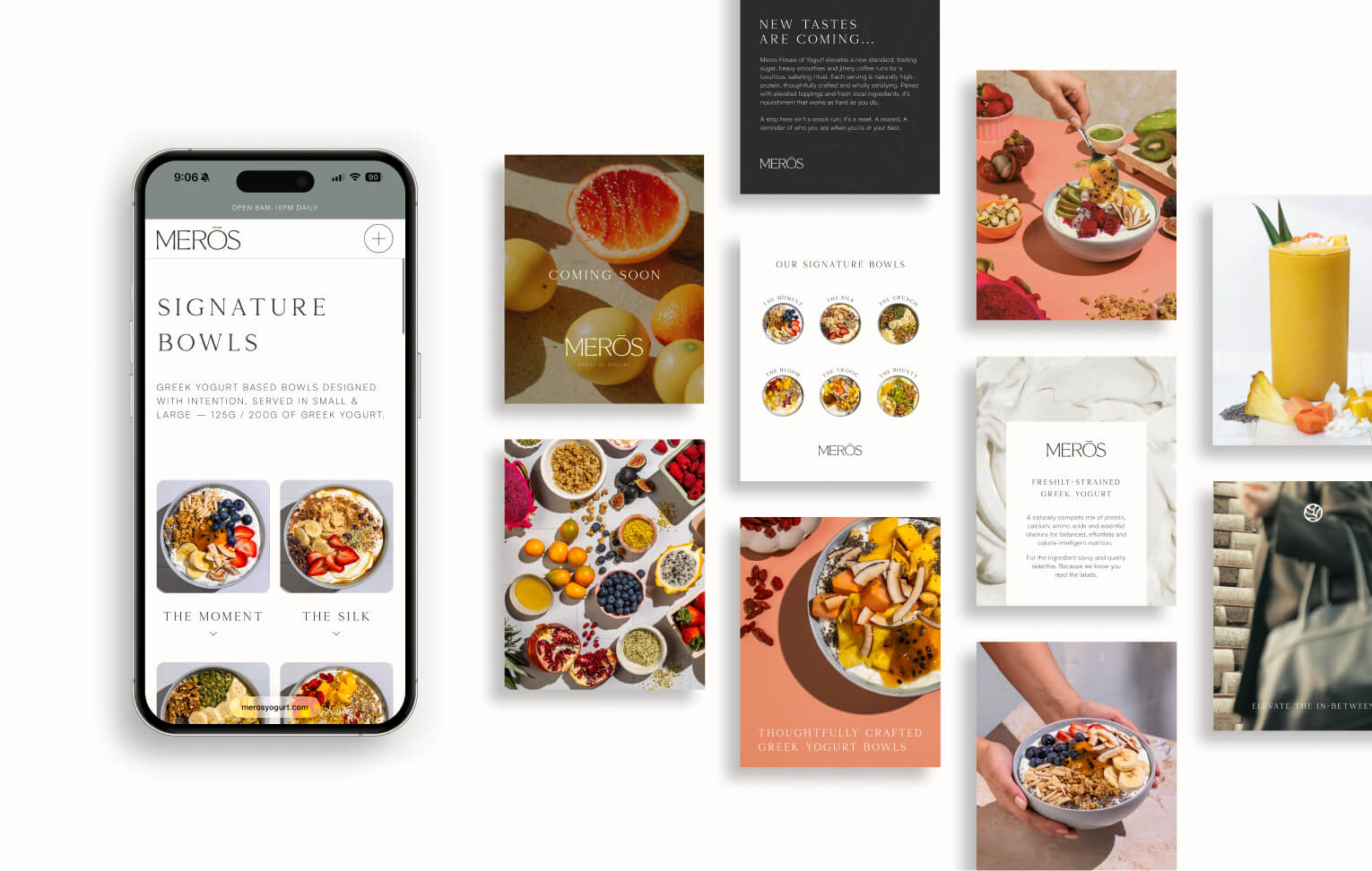
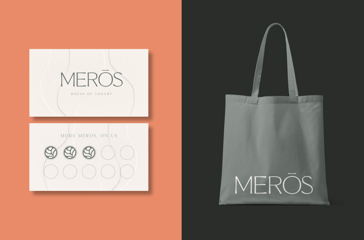
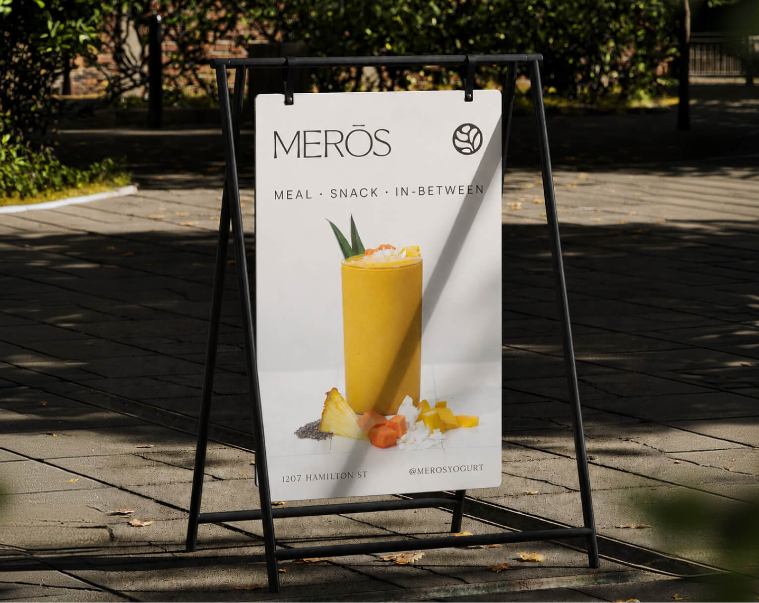
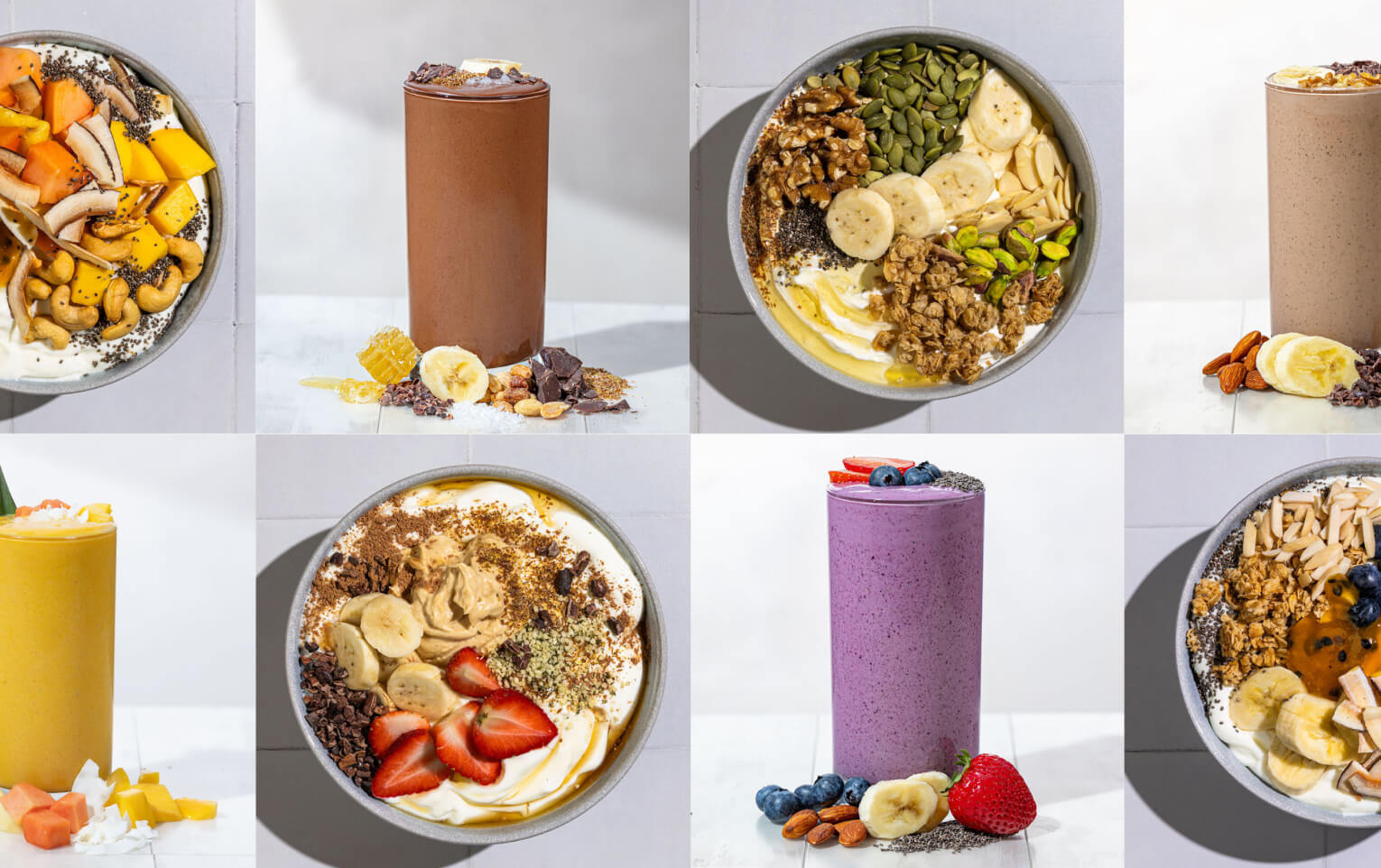
Merōs launched with more than a visual identity. It entered the market with a clearly defined brand idea, a distinctive name, and a strategic foundation designed to guide how the business communicates, looks, and evolves.