

Hotori Homes

REX is rated a Top Branding Agency in Canada by Clutch with 25 International Awards for Brand Strategy, Marketing and Design
Creating a new kind of multiplex living rooted in Japanese intentionality and modern Vancouver life.
The Opportunity
Vancouver’s evolving multiplex zoning has created a new wave of housing opportunity — but much of the market has quickly become saturated with profit-driven developments prioritizing speed, trend-based aesthetics, and short-term appeal over long-term livability.
Hotori Homes set out
Hotori Homes set out
to challenge that standard.
Founded on the belief that multiplex living should feel thoughtful, enduring, and deeply connected to community, Hotori Homes needed a brand that could clearly articulate a different philosophy: one that merges Japanese mindfulness and craftsmanship with the realities of modern urban living in Vancouver.
We partnered with the team to define a strategic market position, develop a foundational brand strategy, create the company name, and build a complete visual identity system capable of launching the brand confidently into market.
Project Scope
Overview
Strategy
- Market and audience research
- Stakeholder interviews
- Competitive analysis
- Audience profiling
- Brand positioning
- Messaging framework
- Brand compass
- Customer journey mapping
- Brand archetype development
Foundation
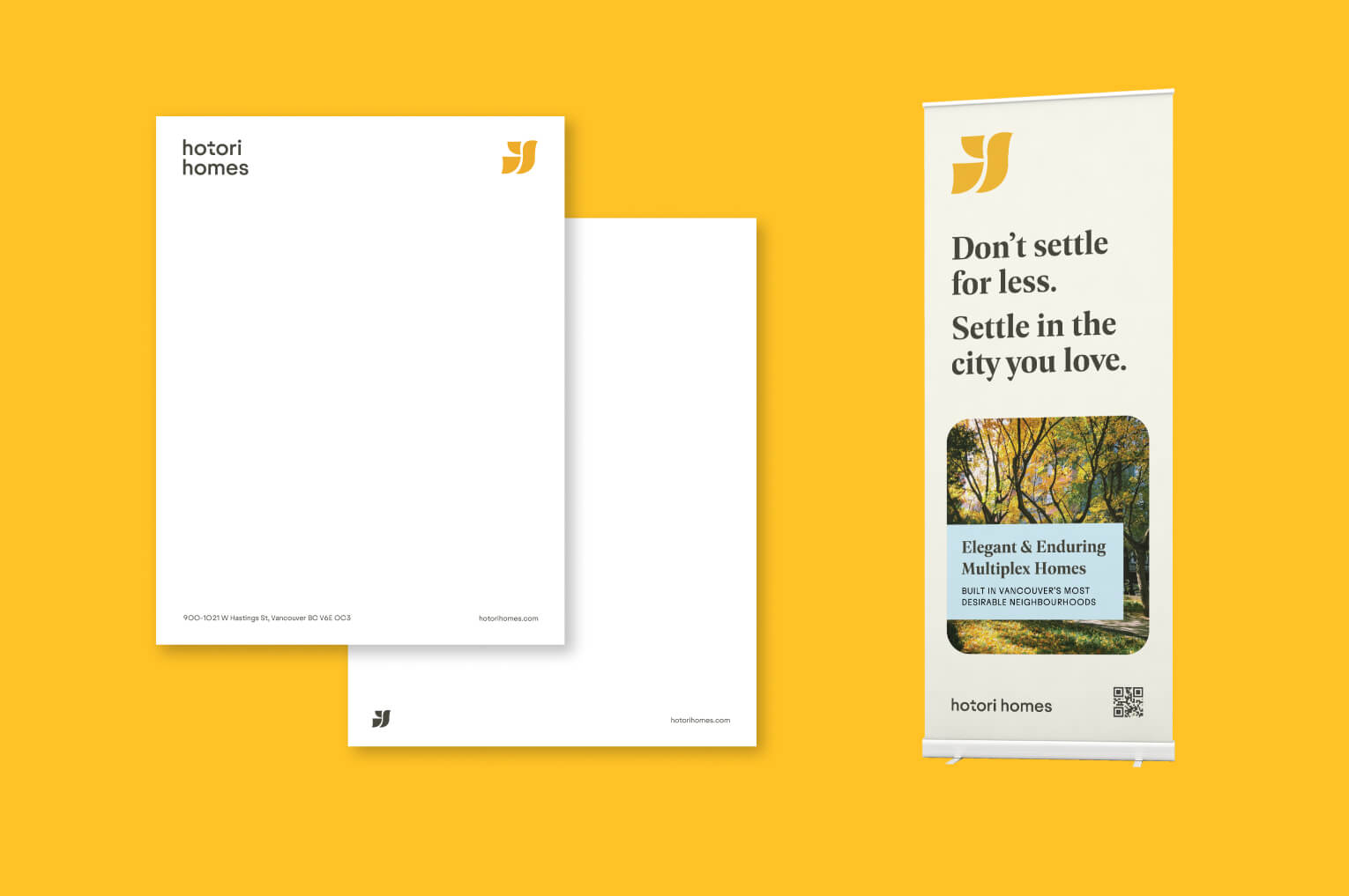
- Business stationery
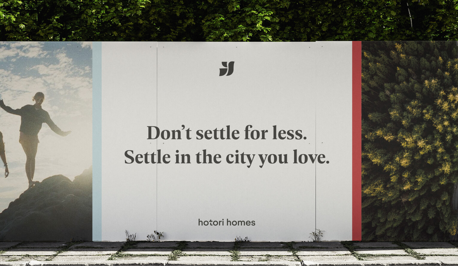
- Site signage and hoarding
- Visual identity system
- Website design
- Marketing collateral
- Brand guidelines
Strategic Insight
Research conducted with developers, real estate professionals, and Vancouver housing stakeholders provided deeper insight into the city’s evolving multiplex market.
As new housing models reshape Vancouver neighbourhoods, there is a growing need for a more thoughtful and enduring approach to urban living — one rooted in intentional design, livability, and long-term connection to the city.
This research positioned Hotori Homes around the idea that staying in the city shouldn’t require compromise. Instead, multiplex living can offer a more intentional and attainable way to remain in the neighbourhoods people already know and love, through homes defined by thoughtful design and enduring craftsmanship.
Naming Strategy
The name Hotori Homes was developed to embody the deeper philosophy behind the brand.
Rooted in Japanese language and symbolism, the name evokes ideas of proximity, connection, and intentional living — reflecting both the physical closeness of multiplex communities and the emotional connection people have to the neighborhoods they call home.
Embedded within the name is the concept of Ori, meaning “to fold” — a subtle reference to transformation, craftsmanship, and the layered nature of multiplex living itself: multiple homes thoughtfully integrated into a singular architectural experience.
The result is a name that feels timeless, culturally grounded, and strategically differentiated within Vancouver’s evolving housing market.
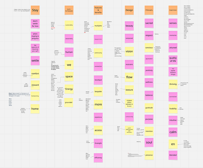
NAMING EXERCISE
Visual Identity
TRANSLATING STRATEGY INTO A COMPLETE VISUAL IDENTITY SYSTEM
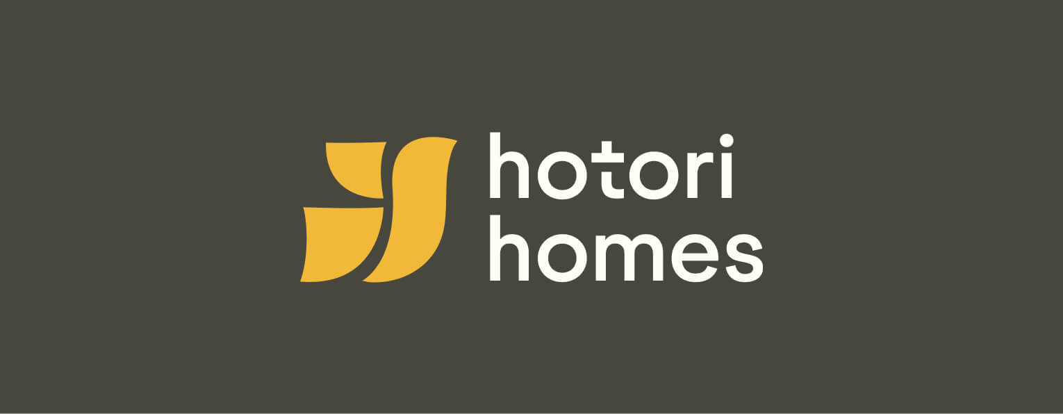
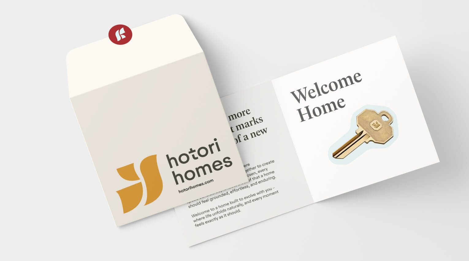
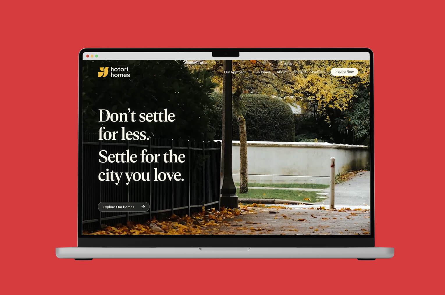
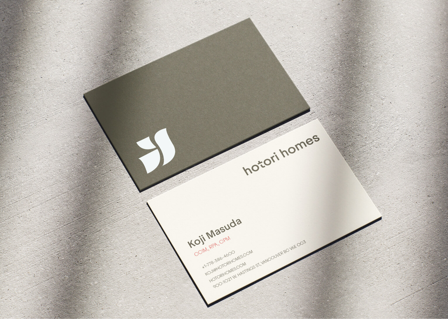
The visual identity for Hotori Homes was designed to reflect the harmony between Japanese intentionality and Vancouver living. Inspired by the city’s natural light, water, and coastal skies, the palette balances soft, airy tones with a deep red accent — a subtle nod to both Canadian and Japanese cultural influence.
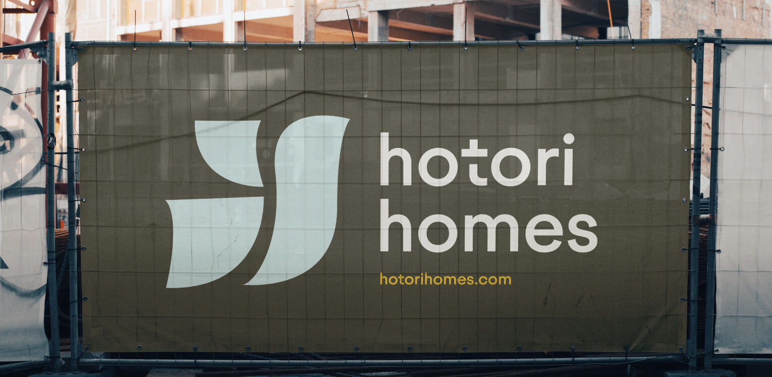
The logo was developed around the concept of flow, a principle deeply rooted in Japanese design philosophy. Its organic forms reference movement, nature, and craftsmanship, while subtly forming an abstract bird symbolizing freedom, home, and connection. Together, the system creates a brand experience that feels calm, enduring, and intentionally connected to the way people want to live.
Conclusion
Hotori Homes launched with a clear strategic foundation and a distinctive market position within Vancouver’s rapidly evolving housing landscape.
By aligning the brand around livability, intentional design, and enduring quality, the company was able to enter the market with a differentiated identity that resonates with modern urban buyers seeking more meaningful alternatives to conventional multiplex development.
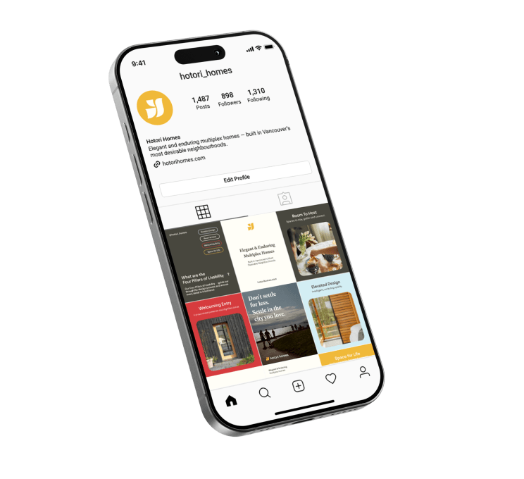
SOCIAL MEDIA GRAPHICS